![]()
Mozilla Firefox 89.0 was officially released today with the focus on redesigned and modernized user interface.
Firefox 89 has a simplified browser chrome and toolbar. It uses floating tab design with rounded corners for active tab. Less toolbar buttons present, and bookmarks, history and downloads are merged into single menu button.
The main menu content has been reorganized and prioritized. Menu items no longer have icons at beginning.
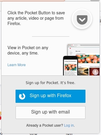
The new release also introduced new ‘Pocket’ icon in left side of the menu button. It allows to save any archive, video or page from Firefox. And it provides buttons to sign in/up pocket, so to view your saved content on any device any time.
Other changes in Firefox 89.0 include:
- Native context menus on Mac OS with dark mode support.
- Reduced number of alerts and messages, so you can browse with fewer distractions.
- Update private browsing mode with even more privacy.
- Smart Zoom support via double-tap with two fingers, or single finger on your Magic Mouse.
- Various security and other fixes.
- Event Timing API Support.
How to Get Firefox 89:
As usual, Ubuntu will publish the Firefox 89 packages through the security & updates repositories in next few days.
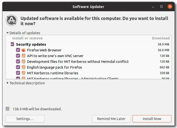
You can just wait until it being available to update in Software Updater:
Alternatively, see the release note and download the portable package from Firefox website:


I love the menu toolbar and always enable it. I hope it is still an option? If not you might as well just use Chrome. Otherwise being a Chrome clone will be the end of Firefox.
Yes, menu bar is still available in main menu -> More Tools -> Customize Toolbar.
I don’t know why Firefox hasn’t figured out that their userbase doesn’t want a crappy version of chrome. That is not just me; they have been steadily losing market share with every change over the past few years. Maybe instead of rewriting the UI or breaking another set of plugins, they should focus on making the engine faster and doing a better job of segmenting individual tab’s memory/CPU usage so that users can find leaky/hog tabs and close them. You know, like chrome’s been able to do for years.
“segmenting individual tab’s memory/CPU usage so that users can find leaky/hog tabs and close them”
This has also been possible in FF for years, and it’s even better than in Chrome.
Check “about:performance”.
I liked the old user interface treatment of tabs and controls just fine!
For folks like me who are somewhat visually impaired, the latest version seems like a regressive step.
I am sure that I will get used to it, but it does seem to be just like some of the other browsers now.
If you want to customize the new look, this is the place to go to…
https://github.com/black7375/Firefox-UI-Fix
&
https://github.com/black7375/Firefox-UI-Fix/tree/photon-style